Web accessibility (also known as a11y) refers to the practice of creating websites that can be used by anyone — be that a person with a disability, a slow connection, outdated or broken hardware or simply someone in an unfavorable environment. For example, adding subtitles to a video would help both your deaf and hard-of-hearing users and your users who are in a loud environment and can’t hear their phone. Similarly, making sure your text isn’t too low contrast will help both your low-vision users and your users who are trying to use their phone in bright sunlight.
You should add a link at the top of each page that goes directly to the main content area so users can skip content that is repeated on multiple Web pages.
Typically this is done on the top of App.vue as it will be the first focusable element on all your pages:
<spanref="backToTop"tabindex="-1"/>
<ulclass="skip-links">
<li>
<ahref="#main"ref="skipLink"class="skip-link">Skip to main content</a>
</li>
</ul>
To hide the link unless it is focused, you can add the following style:
.skip-links {
list-style: none;
}
.skip-link {
white-space: nowrap;
margin: 1emauto;
top: 0;
position: fixed;
left: 50%;
margin-left: -72px;
opacity: 0;
}
.skip-link:focus {
opacity: 1;
background-color: white;
padding: 0.5em;
border: 1pxsolidblack;
}
Once a user changes route, bring focus back to the very beginning of the page, right before the skip link. This can be achieved by calling focus on the backToTop template ref (assuming usage of vue-router):
One of the most important pieces of accessibility is making sure that design can support accessible implementation. Design should consider not only color contrast, font selection, text sizing, and language, but also how the content is structured in the application.
Users can navigate an application through headings. Having descriptive headings for every section of your application makes it easier for users to predict the content of each section. When it comes to headings, there are a couple of recommended accessibility practices:
Nest headings in their ranking order: <h1> - <h6>
Don’t skip headings within a section
Use actual heading tags instead of styling text to give the visual appearance of headings
Landmarks provide programmatic access to sections within an application. Users who rely on assistive technology can navigate to each section of the application and skip over content. You can use ARIA roles to help you achieve this.
HTML
ARIA Role
Landmark Purpose
header
role=“banner”
Prime heading: title of the page
nav
role=“navigation”
Collection of links suitable for use when navigating the document or related documents
main
role=“main”
The main or central content of the document.
footer
role=“contentinfo”
Information about the parent document: footnotes/copyrights/links to privacy statement
aside
role=“complementary”
Supports the main content, yet is separated and meaningful on its own content
search
role=“search”
This section contains the search functionality for the application
form
role=“form”
Collection of form-associated elements
section
role=“region”
Content that is relevant and that users will likely want to navigate to. Label must be provided for this element
<divv-for="item in formItems":key="item.id"class="form-item">
<label:for="item.id">{{ item.label }}: </label>
<input
:type="item.type"
:id="item.id"
:name="item.id"
v-model="item.value"
/>
</div>
<buttontype="submit">Submit</button>
</form>
Notice how you can include autocomplete='on' on the form element and it will apply to all inputs in your form. You can also set different values for autocomplete attribute for each input.
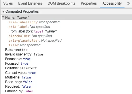
If you inspect this element in your Chrome DevTools and open the Accessibility tab inside the Elements tab, you will see how the input gets its name from the label:
[!caution] Warning:
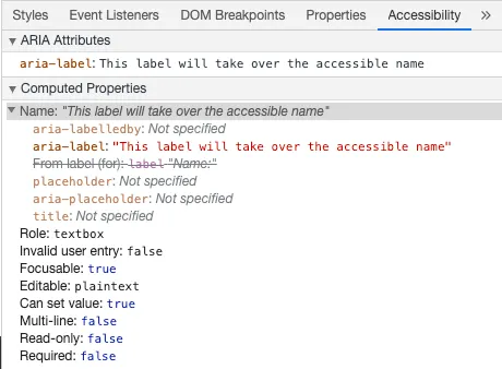
Though you might have seen labels wrapping the input fields like this:
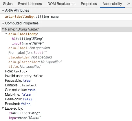
Using aria-labelledby is similar to aria-label except it is used if the label text is visible on screen. It is paired to other elements by their id and you can link multiple ids:
<form
class="demo"
action="/dataCollectionLocation"
method="post"
autocomplete="on"
>
<h1id="billing">Billing</h1>
<divclass="form-item">
<labelfor="name">Name: </label>
<input
type="text"
name="name"
id="name"
v-model="name"
aria-labelledby="billing name"
/>
</div>
<buttontype="submit">Submit</button>
</form>
When this pattern is used inside a reusable component, generate the IDs with
useId() instead of hard-coding
them. This keeps each component instance’s id values unique while still
linking the visible text to the form control:
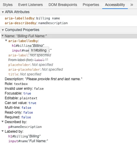
aria-describedby is used the same way as aria-labelledby except provides a description with additional information that the user might need. This can be used to describe the criteria for any input:
<form
class="demo"
action="/dataCollectionLocation"
method="post"
autocomplete="on"
>
<h1id="billing">Billing</h1>
<divclass="form-item">
<labelfor="name">Full Name: </label>
<input
type="text"
name="name"
id="name"
v-model="name"
aria-labelledby="billing name"
aria-describedby="nameDescription"
/>
<pid="nameDescription">Please provide first and last name.</p>
</div>
<buttontype="submit">Submit</button>
</form>
You can see the description by inspecting Chrome DevTools:
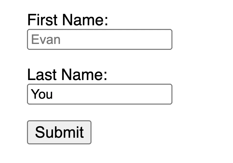
Avoid using placeholders as they can confuse many users.
One of the issues with placeholders is that they don’t meet the color contrast criteria by default; fixing the color contrast makes the placeholder look like pre-populated data in the input fields. Looking at the following example, you can see that the Last Name placeholder which meets the color contrast criteria looks like pre-populated data:
<form
class="demo"
action="/dataCollectionLocation"
method="post"
autocomplete="on"
>
<divv-for="item in formItems":key="item.id"class="form-item">
When adding instructions for your input fields, make sure to link it correctly to the input.
You can provide additional instructions and bind multiple ids inside an aria-labelledby. This allows for more flexible design.
Usually it is not recommended to visually hide labels, even if the input has an accessible name. However, if the functionality of the input can be understood with surrounding content, then we can hide the visual label.
Adding aria-hidden="true" will hide the element from assistive technology but leave it visually available for other users. Do not use it on focusable elements, purely on decorative, duplicated or offscreen content.
<p>This is not hidden from screen readers.</p>
<paria-hidden="true">This is hidden from screen readers.</p>
WCAG 2.1 extends on WCAG 2.0 and allows implementation of new technologies by addressing changes to the web. The W3C encourages use of the most current version of WCAG when developing or updating Web accessibility policies.
WCAG 2.1 Four Main Guiding Principles (abbreviated as POUR):
The World Health Organization estimates that 15% of the world’s population has some form of disability, 2-4% of them severely so. That is an estimated 1 billion people worldwide; making people with disabilities the largest minority group in the world.
There are a huge range of disabilities, which can be divided roughly into four categories:
Visual - These users can benefit from the use of screen readers, screen magnification, controlling screen contrast, or braille display.
Auditory - These users can benefit from captioning, transcripts or sign language video.
Motor - These users can benefit from a range of assistive technologies for motor impairments: voice recognition software, eye tracking, single-switch access, head wand, sip and puff switch, oversized trackball mouse, adaptive keyboard or other assistive technologies.
Cognitive - These users can benefit from supplemental media, structural organization of content, clear and simple writing.
Check out the following links from WebAim to understand from users: